
The Structure of a Typeface
From Stone Carving to the Digital Age

Structure and Evolution
Typography is much more than a collection of symbols used to represent spoken language. It is the result of a technical and aesthetic evolution spanning thousands of years. To understand its significance, we need to examine its structure, from ancient manual techniques to the flexibility of today's digital typefaces, while keeping form and function in balance.
The structure of serif typefaces is a visual record of the transition from traditional craftsmanship to mechanical reproduction. To understand this relationship, it is worth exploring how the movements of the human hand gradually became design conventions that continue to shape our reading experience today.

Stone-Carved Origins: The Roman Brush and Chisel
The origins of serif typefaces can be traced back to Roman epigraphy, particularly the Capitalis Monumentalis, the monumental lettering used in Roman inscriptions. Before the chisel touched the stone, skilled calligraphers would first draw the letters with a flat brush. As the brush reached the end of a vertical or horizontal stroke, its natural lifting motion created a slight widening or flare. Rather than correcting this detail, stonecutters incorporated it into their work. These small extensions helped the chisel finish the carved groove cleanly, reducing the risk of chipping the stone at the ends of the strokes.
Beyond their structural purpose, these terminals also had an important optical function in direct sunlight. On columns and triumphal arches, the depth of the carving created shadows. The serifs helped visually define the shape of each letter, increasing its contrast against the background and making inscriptions easier to read from a distance.

Stroke Modulation and the Legacy of the Pen
When printing was invented, the first typographers did not set out to create an entirely new visual language. Instead, they sought to reproduce the appearance and beauty of handwritten manuscripts. This gave rise to humanist typefaces. Their letterforms inherited the stroke modulation of the broad-edged reed or quill pen. Held at a consistent angle, generally between 30 and 45 degrees, the pen naturally produces variations in stroke thickness, creating heavier and lighter areas throughout each letter.
This modulation is not arbitrary. The human eye is accustomed to recognizing organic forms, and the variation in stroke weight found in serif typefaces reflects the rhythm and movement of handwriting. In this design system, the serif acts as a natural-looking terminal that helps balance the visual weight of the character, preventing the letter from appearing to float on the page.
The Role of Serif Typefaces in Sustained Reading
From a visual-perception perspective, serif typefaces have traditionally played an important role in the design of books and newspapers. Their serifs contribute to the visual rhythm of a line of text, while the relationship between the baseline and the x-height helps establish a consistent structure for lowercase letters. Together, these features can help readers recognize words as visual units, rather than having to process every letter in isolation.
By helping maintain visual continuity along a line of text, well-designed serif typefaces can provide a comfortable reading experience over extended periods. Their structure, rooted in the movements of the human hand and refined through centuries of typographic practice, explains why they remain a familiar choice for printed books and other long-form reading materials.
The Industrial Breakthrough and the Rise of Sans Serif Typefaces
The emergence of sans serif typefaces represented one of the most significant changes in the history of visual communication. It marked a shift away from traditional calligraphic conventions toward a visual language better suited to industrial production, advertising, signage, and the demands of modern urban life.

The Aesthetics of the "Grotesque" and Geometry
The term grotesque, still used to classify some of the earliest sans serif typefaces, originated in the negative reaction of traditional academics and typographers. To the nineteenth-century eye, accustomed to the elegance of calligraphic stroke modulation, these new letterforms appeared crude, unfinished, or even "monstrous." What was perceived as a lack of refinement, however, was actually a different approach to letter construction: one that emphasized simpler forms and more uniform strokes.
The Challenge of Legibility in the Digital Age
The transition from printed pages to computer screens was not simply a matter of transferring existing letterforms to a new medium. It fundamentally changed the way we think about the structure of type. This evolution has involved overcoming hardware limitations and developing typefaces capable of adapting to a wide range of digital environments.
The Pixel Problem and the Dominance of Sans Serif Typefaces
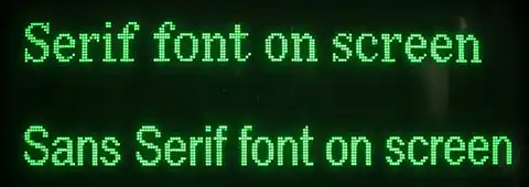
During the early decades of home computing, one of the biggest challenges for typography was the low pixel density of computer monitors. Cathode-ray tube displays and the first LCD panels lacked the resolution needed to reproduce subtle curves and extremely fine serifs accurately. When rendering these details, the software had to determine which pixels to illuminate and which to leave off. This often produced jagged edges, a visual artifact known as aliasing. Fine serifs could appear as blurred marks or disconnected dots, making text harder to read.
This technical limitation helped establish sans serif typefaces as the dominant choice for digital interfaces. Their relatively uniform strokes and lack of small decorative details made them easier to reproduce on low-resolution pixel grids. Fonts such as Arial and Verdana, the latter designed specifically with screen readability in mind, made individual letters easier to distinguish even on relatively poor displays. For decades, this helped reinforce the association between digital typography and the absence of serifs.
Glyphs
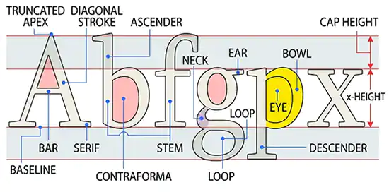
A glyph is the visual representation of a character, number, or symbol. In typography and digital design, its structure is defined by a combination of visual elements and technical metrics that determine how it is displayed and how it relates to surrounding characters.
Visual Elements and the Anatomy of a Letter
The visual structure of a glyph consists of strokes and spaces that give it its distinctive shape:
- Main strokes: The fundamental lines that form a letter, such as vertical stems and horizontal bars.
- Serifs: Small extensions or finishing details at the ends of certain strokes. They are a defining feature of serif typefaces.
- Counters: The enclosed or partially enclosed negative spaces within a glyph, such as the interior of the letters "o" and "b".
- Ascenders and descenders: Parts of lowercase letters that extend above the x-height, as in "d", or below the baseline, as in "p".
Technical Structure and Typographic Metrics
For a glyph to work properly within a line of text, it relies on a coordinate system and a set of reference lines and measurements:
- Baseline: The imaginary horizontal line on which most letters sit.
- X-height: The height of the main body of lowercase letters, typically measured using the letter "x".
- Glyph advance width: The total horizontal distance allocated to a glyph, including its side bearings.
- Side bearings: The blank spaces to the left and right of a glyph, known as the left side bearing and right side bearing. They help establish consistent spacing between characters.
Controlling Space in Typeface Design
In typography, the empty space around letters is just as important as the black strokes that define their shapes. To create readable, well-balanced text, designers rely on two fundamental concepts that are often confused but serve different purposes: spacing, determined by the side bearings, and kerning, which adjusts the space between specific pairs of letters.

Understanding Spacing and Side Bearings
Spacing refers to the default amount of white space assigned to each glyph in a font file.
When a type designer creates a letter, they define its left and right side bearings. These margins, together with the width of the letter itself, determine the total horizontal space the character occupies whenever it is typed. This spacing is part of the font's default metrics and is applied automatically, regardless of which letters appear before or after it.
Adjusting Letter Spacing with Kerning
Kerning is a specific adjustment to the spacing between particular pairs of letters.
Some letter combinations create awkward-looking gaps when their default spacing is left unchanged. For example, in the word "AVION", the angled strokes of the A and V can create an excessive visual gap if their standard side bearings are used without adjustment. Kerning changes the spacing specifically between that pair of letters, bringing them closer together or moving them farther apart as needed to maintain a consistent visual rhythm throughout the text.

Digital Representation
In modern digital fonts, including OpenType and TrueType, glyph outlines and their rendering are defined using several technical components:
- Anchor and control points: Points used to define the position and shape of glyph outlines and to control how strokes are constructed.
- Bézier curves: Mathematical curves that define the contours of letterforms between points on the outline, using control points to determine their shape.
- Hinting instructions: Additional data that helps optimize the appearance of glyphs when they are rendered at small sizes or on low-resolution screens.
From Static Shapes to Dynamic Vectors
The real digital revolution was not limited to improvements in screen resolution. It also transformed the very nature of the font file. In traditional printing, a metal type sort was a physical, fixed object. If a printer needed a bolder or narrower version of a typeface, a different set of metal characters had to be cast. Modern digital fonts, by contrast, are not simply fixed drawings. They are mathematical descriptions of letterforms, commonly based on vector outlines.
This technology has made variable fonts possible, allowing an entire typeface family to be stored in a single font file. Instead of requiring separate files for light, regular, and bold weights, a variable font can contain adjustable design axes. These may control weight, width, or slant, for example. Designers and software can then select values along those axes within their defined ranges, allowing typography to adapt smoothly to different design requirements and viewing environments.

Adaptability and the Future of Reading
Today, one of the defining features of digital typography is its adaptability. Modern web design can use responsive typography to adjust text according to screen size, resolution, and viewing conditions. Variable fonts make it possible to modify characteristics such as weight and width across a range of values, helping designers maintain legibility and visual consistency on different devices.
Thanks to the high pixel density of modern displays, including Retina and 4K screens, serif typefaces have made a strong comeback in digital environments. Their fine details can now be reproduced with a level of precision that was difficult to achieve on early computer screens. Contemporary typography, however, goes beyond simply reproducing the appearance of traditional print. It combines the historical heritage of classical type design with technical flexibility, making it possible to create readable, adaptable text for almost any device, from a smartwatch to a large cinema screen.
The content on this website is protected by copyright. Short excerpts may be quoted provided that a link to the original source is included. Reproduction of the full content without permission is not permitted.